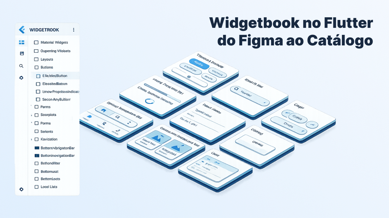
Flutter Widgetbook: How to Document your Design System the Right Way!
How Widgetbook solves the documentation problem in Flutter projects with a custom design system. On Direção Fácil, it became a visual catalog, a contract with Figma, and precise context for Claude Code to generate screens using the right widgets.
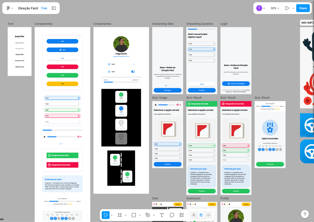
When I started developing Direção Fácil, it was clear from early on that the app would have its own design system. Every button, every card, every progress bar with a specific look, all designed pixel-perfect in Figma.
To implement the components faster, I used an LLM with Figma as a reference. It was a straightforward process: I designed it, fed it to the model, tweaked it, moved on to the next. When I was done, I had 25 components ready: DFButton in 5 variants, DFModule in 4 states, DFQuizBar, DFQuestion, and another dozen more.
But as the components got finished, I noticed a gap: how would I know a component was correct if I could never see it in isolation, outside the context of the whole app? I wanted to be able to open DFModule with all its states side by side, see DFButton in every variant at once, and compare it to Figma before using it on screens. I needed a visual catalog, the kind Material Design has for Flutter's native widgets, but for the components of my own design system.
The first option that came to mind was Storybook, but it doesn't support Flutter. While looking for an alternative, I discovered Widgetbook.
What is Widgetbook
Widgetbook is, basically, the Storybook of Flutter. You create "use cases" for each component: functions that render the widget in specific states. Widgetbook builds a separate interface from your main app, where you navigate through all the components, change parameters in real time, and validate visually.
In practice, it works as an alternative entry point inside the same Flutter project: the real app stays untouched, and Widgetbook is just a different way to run the same code, now in catalog mode.
Installation
In pubspec.yaml, you need four dependencies:
dependencies:
  widgetbook: ^3.0.0

dev_dependencies:
  widgetbook_annotation: ^3.0.0
  widgetbook_generator: ^3.0.0
  build_runner: ^2.4.0
The widgetbook package is the runtime with the visual interface, widgetbook_annotation brings the @UseCase and @App annotations, and widgetbook_generator is the most interesting part: it runs via build_runner, automatically discovers all use cases in the project, and generates the directory file that builds the catalog's sidebar menu.
Creating the first use case
For each component, you create a *_use_case.dart file alongside the widget, following a simple pattern: a function annotated with @UseCase that returns a Widget.
In Direção Fácil, I started with DFButton, which has 5 variants. The use cases file looked like this:
import 'package:widgetbook_annotation/widgetbook_annotation.dart' as widgetbook;

import '../components/buttons/df_button.dart';

@widgetbook.UseCase(name: 'Primary Button', type: DFButton)
Widget buildPrimaryButton(BuildContext context) {
  return DFButton.primary(label: 'Primary Button', onPressed: () {});
}

@widgetbook.UseCase(name: 'Text Button', type: DFButton)
Widget buildTextButton(BuildContext context) {
  return DFButton.text(label: 'Text Button', onPressed: () {});
}

...
Each @UseCase takes a name, which appears in the catalog's sidebar menu, and a type, which is the widget being documented. You can create as many use cases as you want for the same component.
Configuring the entry point
With the use cases created, you need a separate entry point for Widgetbook: a class annotated with @App() where you configure the addons. build_runner automatically generates the directory file from your use cases, with no need to register anything manually. The official documentation covers this step in detail.
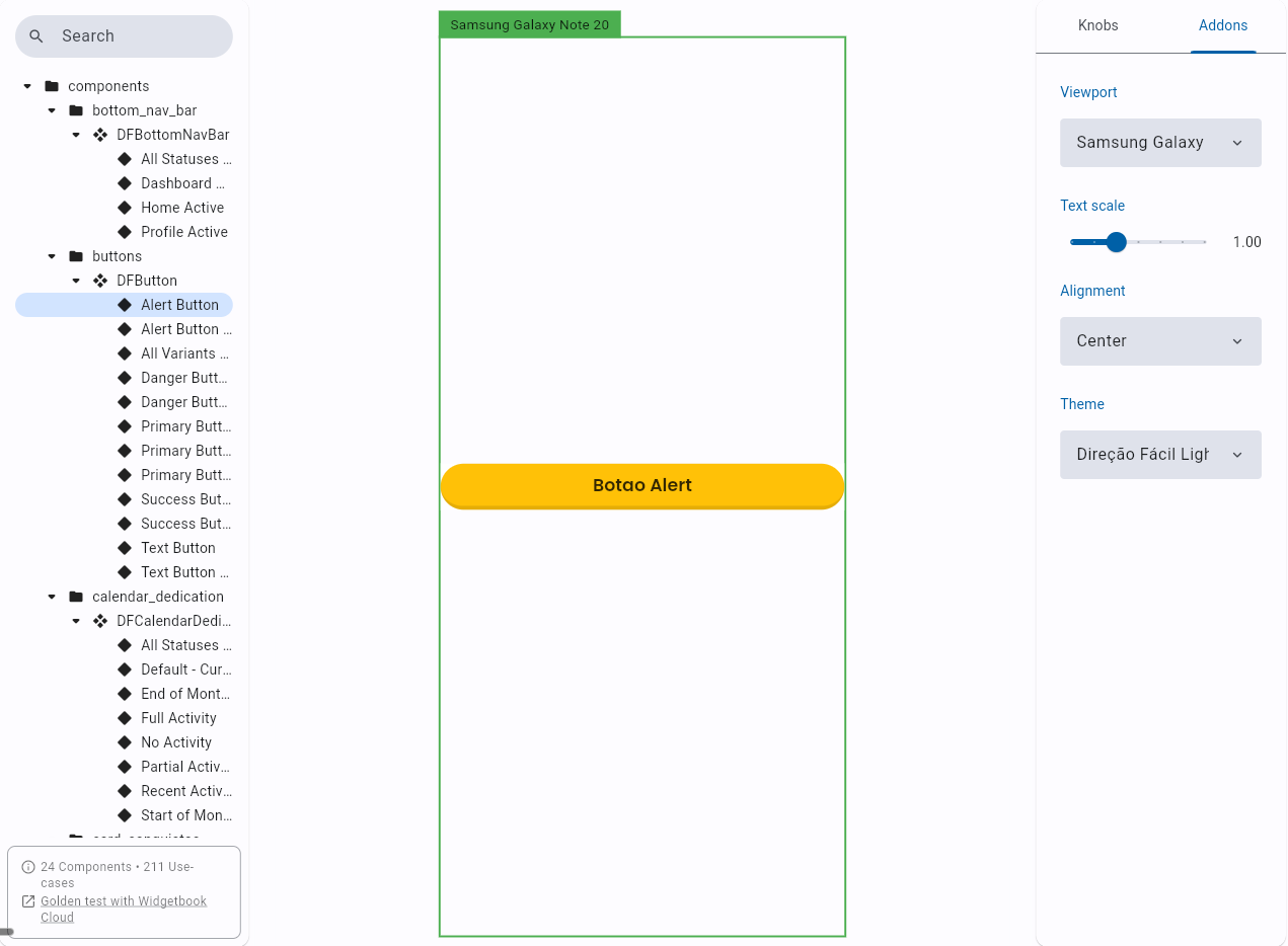
Addons are one of Widgetbook's strongest points. It works similarly to a plugin system: each addon adds a control in the side panel that changes how the component is displayed, without altering the code. With ViewportAddon you simulate specific screen sizes, from an iPhone 13 to a Galaxy Note, without switching devices. TextScaleAddon increases the font scale to test accessibility. MaterialThemeAddon switches between app themes in real time. And AlignmentAddon repositions the component on screen to test different layout contexts, and so on...
Once configured, running the catalog is simple:
# On the simulator
flutter run -t lib/main_widgetbook.dart

# In the browser, to share with the design team
flutter run -d chrome -t lib/main_widgetbook.dart
The example below shows DFProfileBar in the catalog:
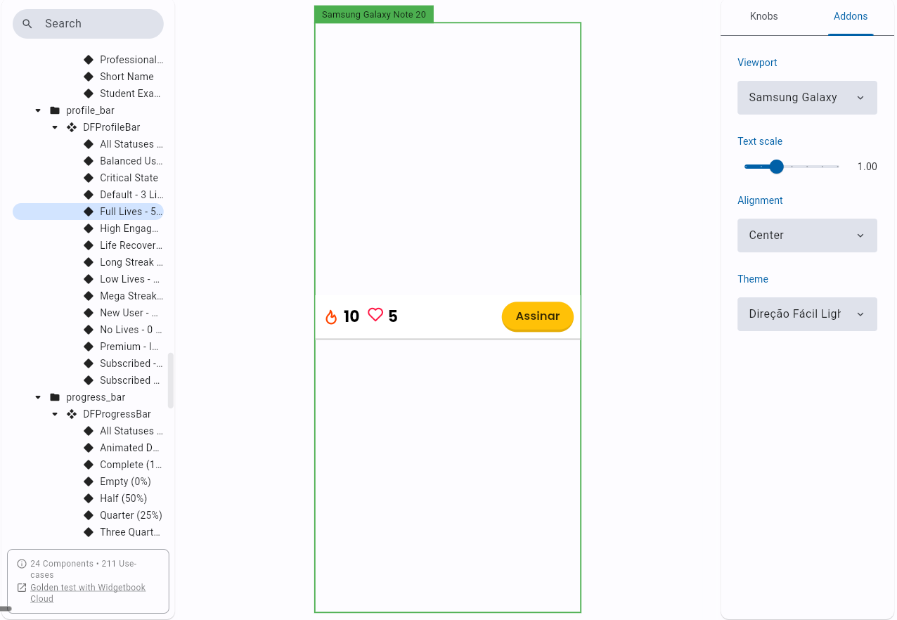
The same component in the real app, for comparison:
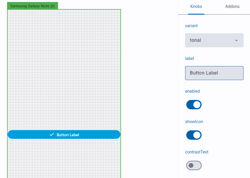
Knobs: interactive parameters
What makes Widgetbook most useful day-to-day are knobs. Instead of creating a use case for every possible combination of parameters, you expose the parameters as controls in the sidebar. Design and dev can test variations without editing code.
In another project that uses the same pattern, the main button's use case looked like this:
@UseCase(name: "default", type: AppButton)
Widget buildButtonUseCase(BuildContext context) {
  final variant = context.knobs.object.dropdown<AppButtonVariant>(
    label: "variant",
    options: AppButtonVariant.values,
    initialOption: AppButtonVariant.tonal,
    labelBuilder: (value) => value.name,
  );

  final label = context.knobs.string(
    label: "label",
    initialValue: "Continue",
  );

  final enabled = context.knobs.boolean(
    label: "enabled",
    initialValue: true,
  );

  return AppButton(
    label: label,
    variant: variant,
    enabled: enabled,
    onPressed: () {},
  );
}
With this, you open the catalog, navigate to the component, and have a side panel to switch the variant, edit the text, and enable or disable it in real time. Widgetbook offers knobs for string, boolean, int, double, color, duration, and dropdown.
The game-changer: Widgetbook as LLM context
The combination that accelerated development the most was this: design system documented in Widgetbook, with the component list exported as a text file, passed as context to Claude Code when writing the screens.
The flow on Direção Fácil went like this: as I implemented the components with LLM help, I created the Widgetbook use cases alongside each one. When a component was ready, I ran the catalog to validate it visually against Figma. Then, when implementing a screen, I passed two contexts to Claude Code: the file with the component documentation and the architecture instructions. The central instruction was direct: don't create new components, only use the ones listed in this documentation.
With that, the LLM would create entire screens with the right widgets, the correct constructors, and the exact parameters. Without this catalog, the model would invent names and signatures of widgets that don't exist, and the screen wouldn't run on the first try. The use cases documentation became the contract between the design system and the generated code.
Conclusion
Widgetbook solves a real problem in Flutter projects with a custom design system: the lack of a visual place to consult all available components.
If you're starting a Flutter project that will have custom components, it's worth setting up Widgetbook from the very first widget. The cost of keeping the catalog up to date is practically zero when you create the use case alongside the component. And the benefit of having a catalog that runs in the simulator or browser, that can be shared with design for validation, and that serves as precise context for any collaborator, pays off long before the project grows.
What I used here is just the basics. Widgetbook goes well beyond that: it has support for golden tests, which are automated visual regression tests where you take a snapshot of the component and any future change is compared against that reference. If something changes by accident, the test fails. And there's Widgetbook Cloud, which integrates visual reviews directly into the pull request flow: on every PR, the platform compares visual changes between builds and publishes the result as a status on the repository, allowing design and dev to approve or block merging based on what actually changed in the interface. For teams working with a design system, these two features change the game.
This article was translated from Portuguese with the help of an LLM. The original version may contain nuances not fully captured in this translation.