Enhancing User Experience with Keyboards on iOS using Keyboard Actions
You'll never struggle with the iOS Keyboard in Flutter again! See how to solve a common problem in mobile apps for iOS that is…
Summary
In this article, we'll explore how we solved a common problem in mobile apps for iOS: the absence of the "Done" and "Next" buttons on the iOS numeric keyboard, and we'll also discuss how we implemented an elegant solution using the keyboard_actions package.
The iOS Keyboard Problem
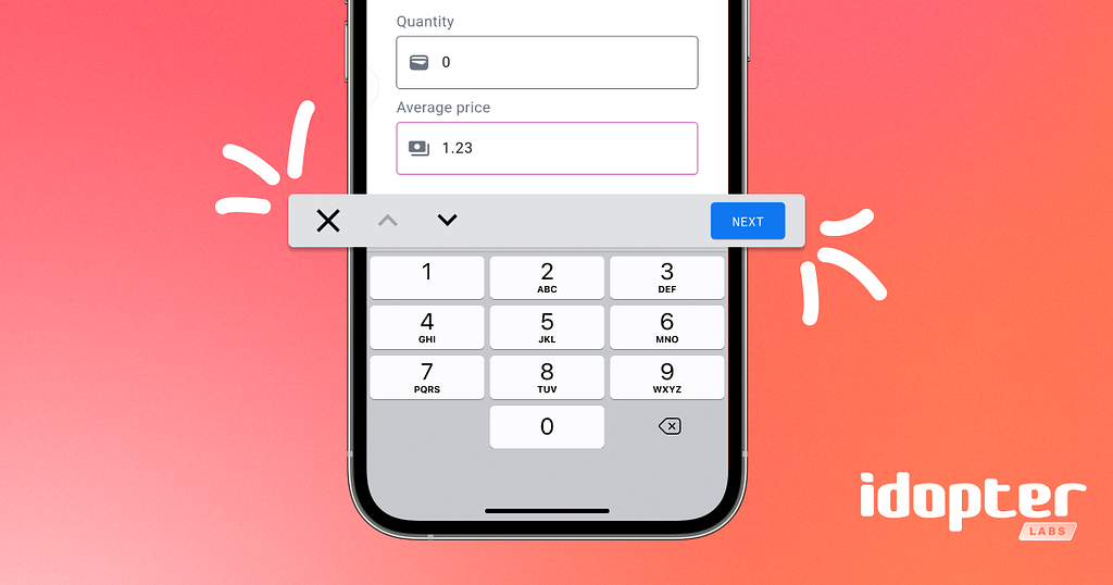
Mobile app developers frequently face a frustrating challenge when working with keyboards on iOS, especially with the numeric keyboard, which is a keyboard without action buttons that help with navigation flow between form fields.
This problem becomes particularly annoying when:
- Users need to fill out forms with multiple numeric fields;
- Navigation between fields becomes difficult without a clear way to finish input;
- The user experience is impaired, especially in data-heavy apps;
- Difficulty closing the keyboard after typing.
We encountered this problem while developing a financial application where users needed to enter values in several numeric fields. The absence of an intuitive way to complete input and navigate between fields was causing friction in the user experience.
The Solution: Keyboard Actions
We found a robust solution using the keyboard_actions package. This library allowed us to create a custom action bar that floats above the keyboard, offering navigation buttons and an explicit "Done" button.
First we need to add the dependency to our project. In the pubspec.yaml file:
dependencies:
  flutter:
    sdk: flutter
  keyboard_actions: ^4.2.0  # Versão no momento da criação deste post
Before creating our encapsulated solution, let's understand how the keyboard_actions package works directly. Here's what a basic implementation for a simple form would look like:
import 'package:flutter/material.dart';
import 'package:keyboard_actions/keyboard_actions.dart';
// ... //
class _FormularioBasicoScreenState extends State<FormularioBasicoScreen> {
  final FocusNode _valorFocusNode = FocusNode();
  final FocusNode _quantidadeFocusNode = FocusNode();
  final FocusNode _observacaoFocusNode = FocusNode();

  final TextEditingController _valorController = TextEditingController();
  final TextEditingController _quantidadeController = TextEditingController();
  final TextEditingController _observacaoController = TextEditingController();

  KeyboardActionsConfig _buildConfig(BuildContext context) {
    return KeyboardActionsConfig(
      keyboardActionsPlatform: KeyboardActionsPlatform.ALL,
      keyboardBarColor: Colors.grey[200],
      nextFocus: true,
      actions: [
        KeyboardActionsItem(
          focusNode: _valorFocusNode,
          displayArrows: true,
          displayDoneButton: false,
          toolbarButtons: [
            (node) {
              return GestureDetector(
                onTap: () => _quantidadeFocusNode.requestFocus(),
                child: Text("NEXT"),
              );
            },
          ],
        ),
        KeyboardActionsItem(
          focusNode: _quantidadeFocusNode,
          displayArrows: true,
          displayDoneButton: false,
          toolbarButtons: [
            (node) {
              return GestureDetector(
                onTap: () => _observacaoFocusNode.requestFocus(),
                child: Text("NEXT"),
              );
            },
          ],
        ),
        KeyboardActionsItem(
          focusNode: _observacaoFocusNode,
          displayArrows: true,
          displayDoneButton: false,
          toolbarButtons: [
            (node) {
              return GestureDetector(
                onTap: () => _submitForm(),
                child: Text("DONE"),
              );
            },
          ],
        ),
      ],
    );
  }

  @override
  Widget build(BuildContext context) {
    return Scaffold(
      appBar: AppBar(title: Text("Formulário Básico")),
      body: KeyboardActions(
        config: _buildConfig(context),
        child: Padding(
          padding: EdgeInsets.all(16.0),
          child: Column(
            children: [
              TextFormField(
                focusNode: _valorFocusNode,
                controller: _valorController,
                decoration: InputDecoration(labelText: "Valor"),
                keyboardType: TextInputType.numberWithOptions(decimal: true),
              ),
              // ... //
            ],
          ),
        ),
      ),
    );
  }
}
As we can see, this basic approach works, but presents several problems:
- Repetitive code: We need to manually define each button ("Next" and "Done") in the toolbar for each field.
- Hard to maintain: If we add or remove fields, we need to manually redo all connections between focus nodes.
- Lack of reuse: The navigation logic between fields needs to be reimplemented in every form in the app.
- Visual consistency: It's difficult to ensure that button appearance is consistent across all forms.
- Growing complexity: Complexity increases exponentially with the number of fields in the form.
Why Encapsulate?
Facing these challenges, we decided to encapsulate the keyboard_actions logic in a class, which provided us with several benefits:
- Code reuse: We can use the same solution across all forms in the app.
- Simplified maintenance: Updates to the keyboard interface are made in a single place.
- Visual consistency: We ensure that all forms have the same appearance and behavior.
- Ease of use: We reduce the amount of boilerplate code needed to implement the keyboard toolbar.
- Adaptability: Our solution automatically adapts to the number of fields in the form.
Next, we developed a reusable controller to manage keyboard actions consistently throughout the app. This controller became a crucial component that we now use in all our forms.
Implementing the Keyboard Actions Controller
We created a utility class called KeyboardActionsController that encapsulates all the logic needed to configure the custom action bar. This class generates configurations for the KeyboardActions widget based on a list of focus nodes and a callback for when the user finishes input.
import "package:flutter/material.dart";
import "package:keyboard_actions/keyboard_actions.dart";

class KeyboardActionsController {
  static List<KeyboardActionsItem> _buildKeyboardItems(
    BuildContext context,
    List<FocusNode> focusNodesSteps,
    VoidCallback? doneCallback,
  ) {
    return List.generate(
      focusNodesSteps.length,
      (index) {
        void previousStep() {
          focusNodesSteps[index - 1].requestFocus();
        }

        void nextStep() {
          focusNodesSteps[index + 1].requestFocus();
        }

        void doneStep() {
          focusNodesSteps[index].unfocus();
          doneCallback?.call();
        }

        return KeyboardActionsItem(
          focusNode: focusNodesSteps[index],
          displayDoneButton: false,
          displayArrows: false,
          toolbarButtons: [
            (node) {
              return IconButton(
                icon: const Icon(Icons.close),
                tooltip: "Close",
                iconSize: IconTheme.of(context).size,
                color: IconTheme.of(context).color,
                onPressed: node.unfocus,
              );
            },
            (_) {
              return IconButton(
                icon: const Icon(Icons.keyboard_arrow_up),
                tooltip: "Previous",
                iconSize: IconTheme.of(context).size,
                color: IconTheme.of(context).color,
                disabledColor: Theme.of(context).disabledColor,
                onPressed: index > 0 ? previousStep : null,
              );
            },
            (_) {
              return IconButton(
                icon: const Icon(Icons.keyboard_arrow_down),
                tooltip: "Next",
                iconSize: IconTheme.of(context).size,
                color: IconTheme.of(context).color,
                disabledColor: Theme.of(context).disabledColor,
                onPressed: index < focusNodesSteps.length - 1 ? nextStep : null,
              );
            },
            (_) => const Spacer(),
            (node) {
              return Padding(
                padding: const EdgeInsets.all(4.0),
                child: TextButton(
                  onPressed:
                      index < focusNodesSteps.length - 1 ? nextStep : doneStep,
                  child: Text(
                    index < focusNodesSteps.length - 1 ? "NEXT" : "DONE",
                    style: TextStyle(
                      color: IconTheme.of(context).color,
                    ),
                  ),
                ),
              );
            },
          ],
        );
      },
    );
  }

  static KeyboardActionsConfig buildConfigKeyboardActions({
    required BuildContext context,
    required List<FocusNode> focusNodesSteps,
    VoidCallback? doneCallback,
  }) {
    return KeyboardActionsConfig(
      keyboardActionsPlatform: KeyboardActionsPlatform.ALL,
      keyboardBarColor: Colors.grey[200],
      nextFocus: true,
      actions: _buildKeyboardItems(context, focusNodesSteps, doneCallback),
    );
  }
}
Implementation in a Real Case
In our financial app, we implemented this solution in a form for creating stock price alerts. Here's how we integrated the KeyboardActionsController in the real flow:
import 'package:flutter/material.dart';
import 'package:keyboard_actions/keyboard_actions.dart';
import 'keyboard_actions_controller.dart';
// Controllers for text fields
final TextEditingController valorController = TextEditingController();
final TextEditingController quantidadeController = TextEditingController();
final TextEditingController observacaoController = TextEditingController();
// FocusNodes for each text field
final List<FocusNode> focusNodes = List.generate(3, (_) => FocusNode());
void submitForm() {
ScaffoldMessenger.of(context).showSnackBar(
const SnackBar(
content: Text("Formulário enviado com sucesso!"),
duration: Duration(seconds: 2),
),
);
}
@override
Widget build(BuildContext context) {
return Scaffold(
body: KeyboardActions(
config: KeyboardActionsController.buildConfigKeyboardActions(
context: context,
focusNodesSteps: focusNodes,
doneCallback: submitForm,
),
child: SingleChildScrollView(
padding: const EdgeInsets.all(16.0),
child: Column(
crossAxisAlignment: CrossAxisAlignment.start,
children: [
const SizedBox(height: 24),
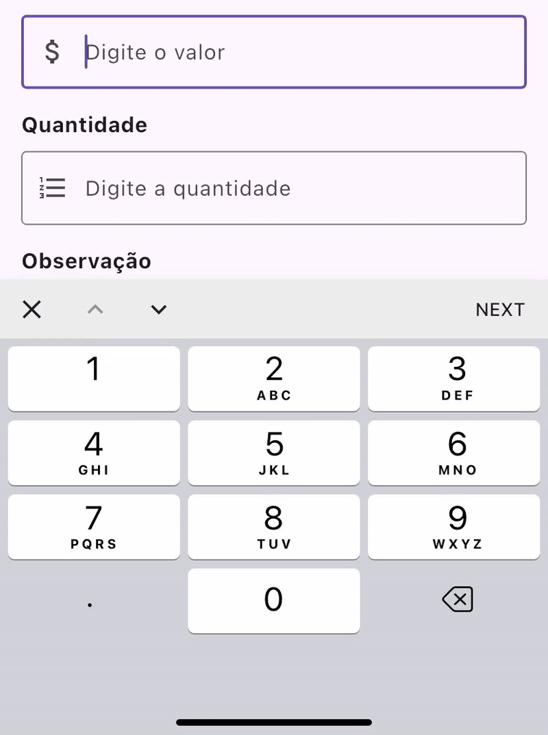
TextFormField(
focusNode: focusNodes[0],
controller: valorController,
decoration: const InputDecoration(
hintText: "Digite o valor",
),
keyboardType: const TextInputType.numberWithOptions(decimal: true),
textInputAction: TextInputAction.next,
),
const SizedBox(height: 16),
TextFormField(
focusNode: focusNodes[1],
controller: quantidadeController,
decoration: const InputDecoration(
hintText: "Digite a quantidade",
),
keyboardType: const TextInputType.numberWithOptions(decimal: true),
textInputAction: TextInputAction.next,
),
const SizedBox(height: 16),
TextFormField(
focusNode: focusNodes[2],
controller: observacaoController,
decoration: const InputDecoration(
hintText: "Digite uma observação",
),
textInputAction: TextInputAction.done,
),
const SizedBox(height: 24),
Center(
child: ElevatedButton(
onPressed: submitForm,
child: const Text("ENVIAR FORMULÁRIO"),
),
),
],
),
),
),
);
}
Full implementation at github.com/TiagoDanin/keyboard_actions_example.
Results Achieved
After implementing this solution, we observed significant improvements in user experience:
- Intuitive navigation between fields accelerated the data entry process;
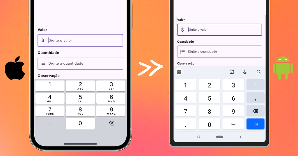
- Android and iOS users now have a uniform experience, regardless of native keyboard differences;
- Allows closing the keyboard after typing.
The key to success is the correct configuration of FocusNodes and the customization of toolbar buttons. In our controller, the navigation buttons are intelligently enabled or disabled based on the current focus position.
Conclusion
User experience in mobile apps is often determined by seemingly small details, such as ease of form filling. Our KeyboardActionsController solved a specific iOS problem that was impairing the user experience in our Flutter mobile apps.
This solution demonstrates how we can overcome native platform limitations while maintaining a consistent, high-quality user experience across all devices. The code we shared is flexible and adaptable for different projects and scenarios, making it a valuable tool in any team's Flutter development toolkit.
This article was translated from Portuguese with the help of an LLM. The original version may contain nuances not fully captured in this translation.