Creating Apps for Android Wear OS with Jetpack Compose
A practical guide on how to develop apps for Android Wear OS using the modern Jetpack Compose toolkit.
Jetpack Compose on Wear OS
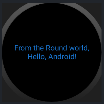
Google announced at Google I/O the beta of Jetpack Compose for Wear OS, the Android version for Smartwatches. Compose allows you to create interfaces quickly using declarative syntax, similar to SwiftUI on iOS. This article demonstrates creating a simple application in just a few minutes using modern Android development technology.
The Application
The app tracks the amount of water consumed during the day. It requires the latest version of Android Studio (in this case, Android Studio Electric Eel 2022.1.1 Canary 5).
Starting a New Project
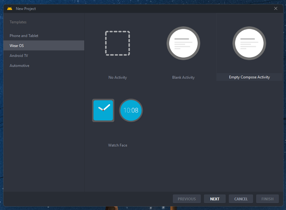
With Android Studio open, create a new project. In the template list, select "Wear OS >> Empty Compose Activity" and continue.
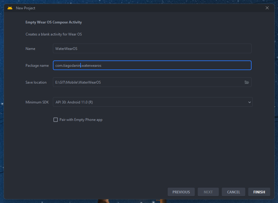
Configure the app with name, ID, project location, and minimum Android Wear OS version (API Level 30 for this example).
Color Customization
Customization in Compose happens through Kotlin files in /theme, not via XML. To change colors, modify variable references like primary:
val Blue700 = Color(0xFF1976d2)
val Blue900 = Color(0xFF0d47a1)
val DeepPurple200 = Color(0xFFb39ddb)
val DeepPurple400 = Color(0xFF512da8)

internal val wearColorPalette: Colors = Colors(
    primary = Blue700,
    primaryVariant = Blue900,
    secondary = DeepPurple200,
    secondaryVariant = DeepPurple400,
    error = Color.Red,
    onPrimary = Color.Black,
    onSecondary = Color.Black,
    onError = Color.Black
)
Note: The Color function represents colors in ARGB (example: red is Color(0xFFFF0000)).
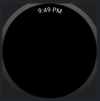
Creating the Main Screen
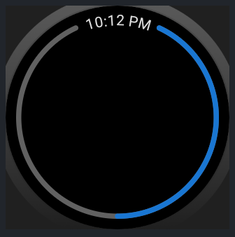
The main screen resides in MainActivity.kt. The Scaffold is a component that provides a base structure, showing system elements like the clock at the top:
@OptIn(ExperimentalWearMaterialApi::class)
@Composable
fun WearApp() {
    WaterWearOSTheme {
        Scaffold(
            modifier = Modifier
                .fillMaxSize()
                .background(MaterialTheme.colors.background),
            timeText = {
                TimeText()
            },
        ) {}
    }
}
The layout uses:
WaterWearOSTheme { UI }- applies the theme to internal elementsScaffold(Props) { UI }- base layout structureTimeText()- default clock at the top
Modifiers (Modifier) customize elements. .fillMaxSize() occupies maximum space; .background() defines background color.
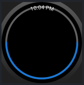
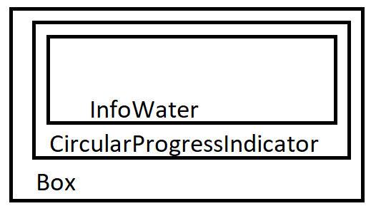
Circular Progress Bar
Import the new Compose function in the Scaffold body:
@OptIn(ExperimentalWearMaterialApi::class)
@Composable
fun WearApp() {
    WaterWearOSTheme {
        Scaffold(
            modifier = Modifier
                .fillMaxSize()
                .background(MaterialTheme.colors.background),
            timeText = {
                TimeText()
            },
        ) {
            ProgressIndicatorWater()
        }
    }
}

@Composable
fun ProgressIndicatorWater() {}
Use CircularProgressIndicator to create the bar. The main properties are:
startAngle- start angleendAngle- end angleprogress- value between 0.0f (0%) and 1.0f (100%)
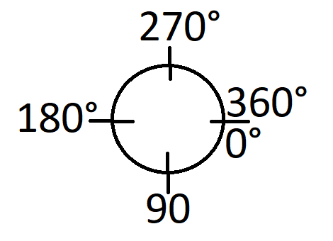
The angles follow standard circular arrangement. Configure startAngle = 295f, endAngle = 245f to position the bar above the time text.
@Composable
fun ProgressIndicatorWater() {
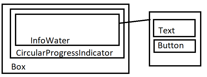
Box(modifier = Modifier.fillMaxSize(), contentAlignment = Alignment.Center) {
CircularProgressIndicator(
startAngle = 295f,
endAngle = 245f,
progress = 0.5f,
strokeWidth = 5.dp,
modifier = Modifier
.fillMaxSize()
.padding(all = 10.dp)
)
InfoWater()
}
}
@Composable
fun InfoWater() {}
Adding Information and Actions
Inside InfoWater, use Column to align elements vertically:
@Composable
fun InfoWater() {
Column(
modifier = Modifier.fillMaxSize(),
verticalArrangement = Arrangement.Center,
horizontalAlignment = Alignment.CenterHorizontally,
) {
Text(
modifier = Modifier
.fillMaxWidth()
.padding(horizontal = 30.dp),
textAlign = TextAlign.Center,
color = MaterialTheme.colors.primary,
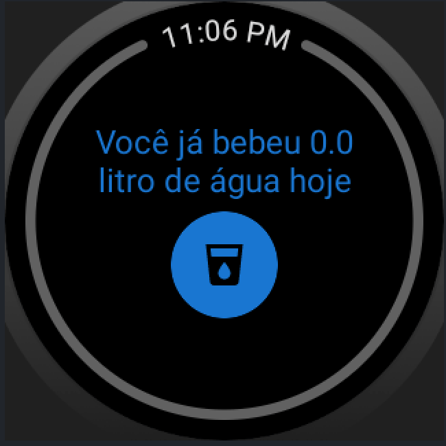
text = "Você já bebeu 1 litro de água hoje"
)
Button(
modifier = Modifier.padding(top = 5.dp),
onClick = {},
) {
Icon(
painter = painterResource(id = R.drawable.cup_water),
contentDescription = "Cup Water",
modifier = Modifier
.size(ButtonDefaults.DefaultButtonSize)
.wrapContentSize(align = Alignment.Center),
)
}
}
}
The three main layout elements are:
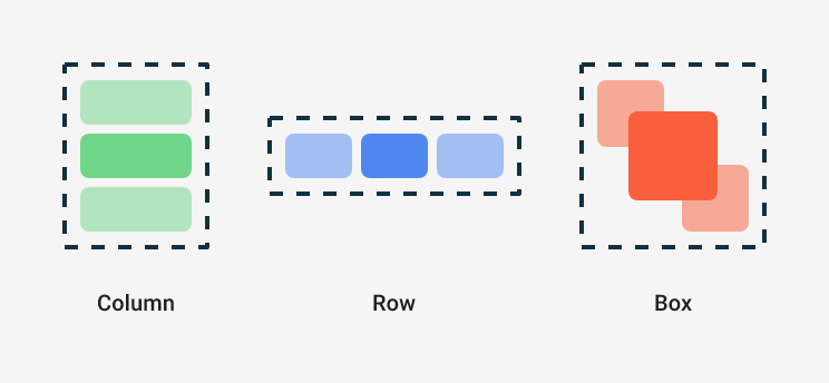
- Box - overlays elements
- Column - aligns vertically
- Row - aligns horizontally
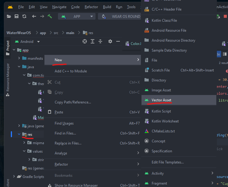
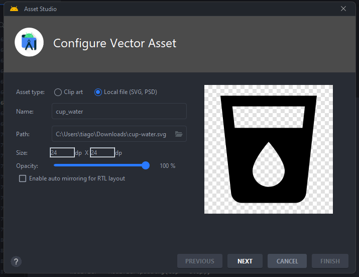
To import custom icons, download SVGs from Material Design Icons Community and use "New > Vector Asset" in the res folder.
State Logic
Create state to track liters consumed:
private val count: MutableState<Float> = mutableStateOf(0f)
Modify the progress bar to consider the recommendation of 3 liters per day:
@Composable
fun ProgressIndicatorWater() {
    val recomedByDay = 3.0f
    val progressOfDay: Float = count.value / recomedByDay

    Box(modifier = Modifier.fillMaxSize(), contentAlignment = Alignment.Center) {
        CircularProgressIndicator(
            startAngle = 295f,
            endAngle = 245f,
            progress = progressOfDay,
            strokeWidth = 5.dp,
            modifier = Modifier
                .fillMaxSize()
                .padding(all = 10.dp)
        )
        InfoWater()
    }
}
Update text and button to reflect the state:
@Composable
fun InfoWater() {
    Column(
        modifier = Modifier.fillMaxSize(),
        verticalArrangement = Arrangement.Center,
        horizontalAlignment = Alignment.CenterHorizontally,
    ) {
        Text(
            modifier = Modifier
                .fillMaxWidth()
                .padding(horizontal = 30.dp),
            textAlign = TextAlign.Center,
            color = MaterialTheme.colors.primary,
            text = "Você já bebeu ${count.value} litro de água hoje"
        )
        Button(
            modifier = Modifier.padding(top = 5.dp),
            onClick = { count.value += 0.5f },
        ) {
            Icon(
                painter = painterResource(id = R.drawable.cup_water),
                contentDescription = "airplane",
                modifier = Modifier
                    .size(ButtonDefaults.DefaultButtonSize)
                    .wrapContentSize(align = Alignment.Center),
            )
        }
    }
}
Each button click adds 0.5 liters.
Next Steps
The development used available components from Jetpack Compose for Wear OS. Consult the documentation at "developer.android.com/training/wearables/compose" to explore other UI components.
Consider implementing data persistence for future improvements.
Repository: Github.com/TiagoDanin/WearOS-Count-Water-App
This article was translated from Portuguese with the help of an LLM. The original version may contain nuances not fully captured in this translation.